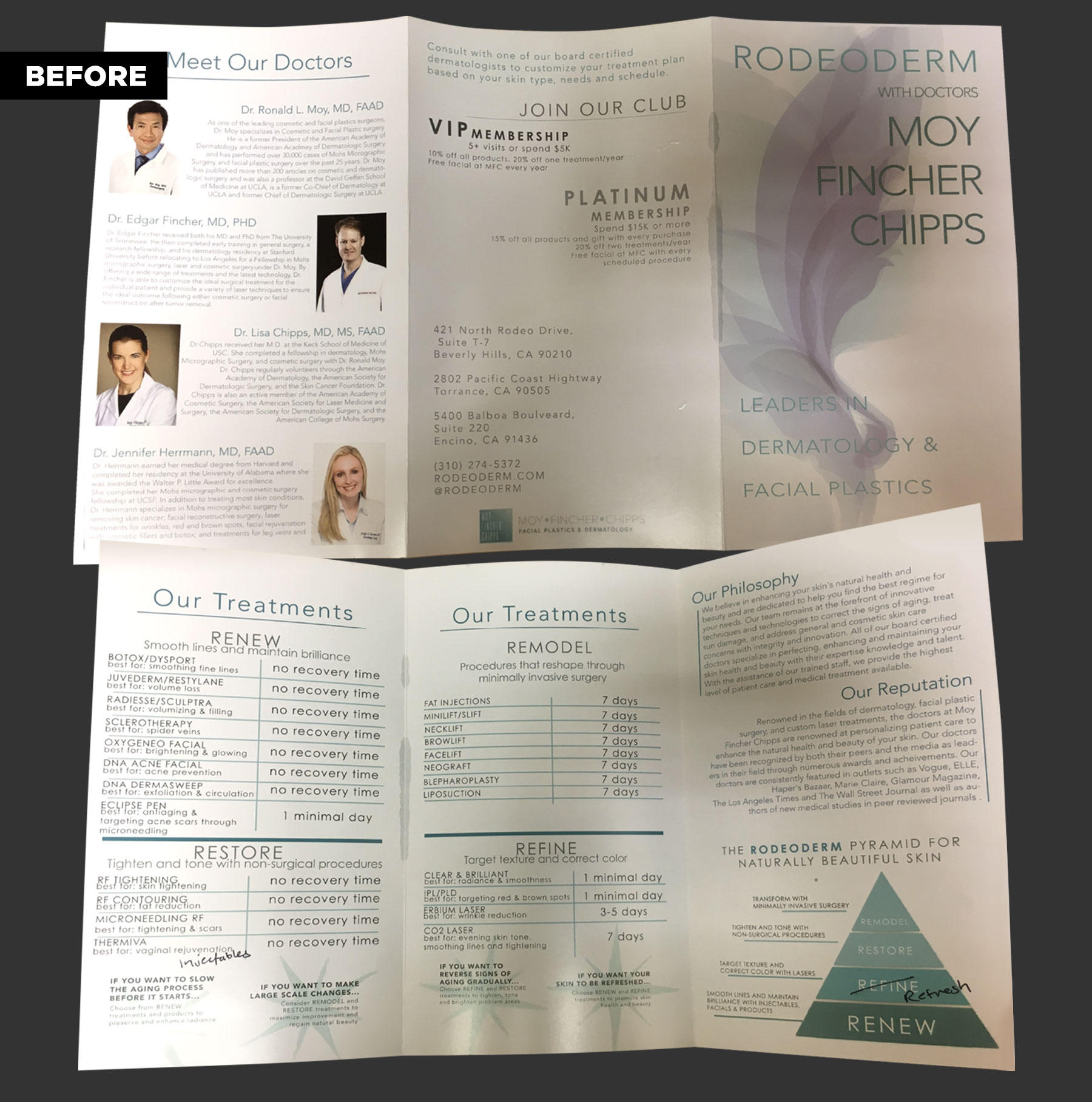
The Before

Client
MOY, FINCHER, CHIPPS FACIAL PLASTICS & DERMATOLOGY

What
BRAND COLLATERAL SERIES For 3 Departments

Everybody loves a makeover. An established dermatology & plastic surgery group approached me looking for a total body reconstruction of their marketing materials. They needed marketing tools which well-represented their professional caliber and “Rodeo Drive” status.
Client
MOY, FINCHER, CHIPPS FACIAL PLASTICS & DERMATOLOGY

What
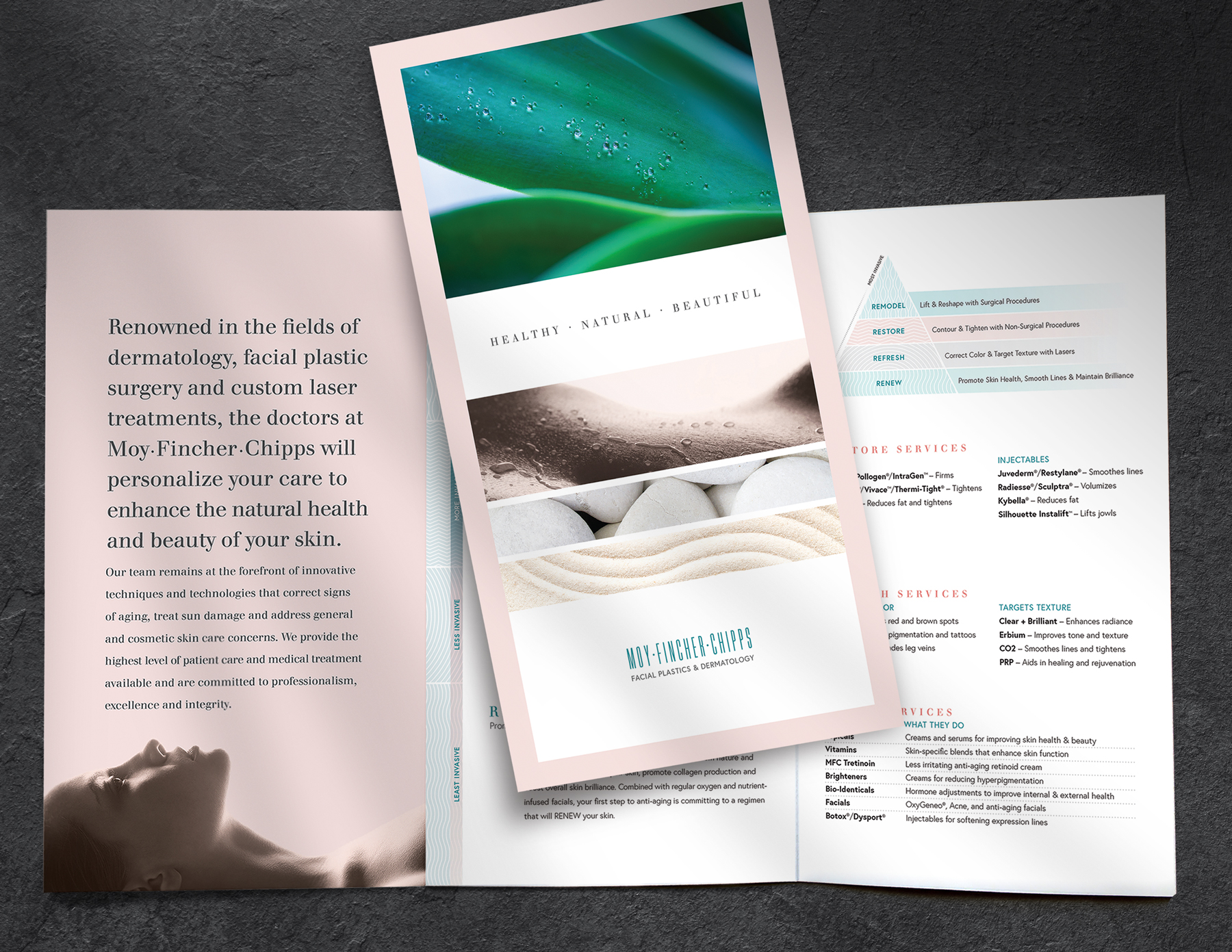
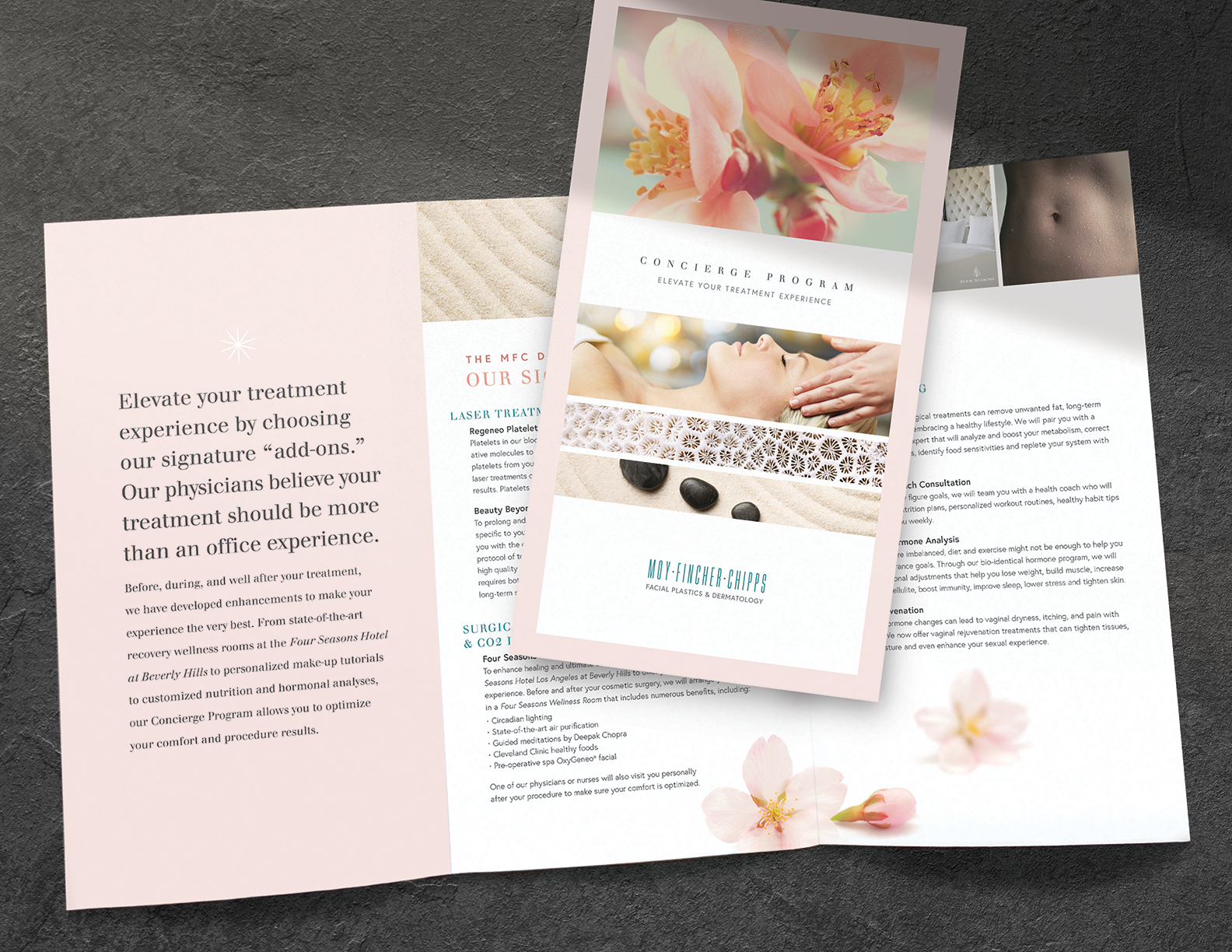
BRAND COLLATERAL SERIES, AFTER

This medical group wanted a modern and "clean" look that also highlighted their reverence for nature and restorative beauty.

In the process of design development, I studied the group’s services to understand the up close and personal nature of their business. Then I referenced ocean imagery and close up botanical photography and built a color palette with gentle tones that complimented the existing brand teal. All of natural imagery used has symbolic meanings (eg: cherry blossoms for renewal, aloe for healing), and I also created graphic representations for each level of their service pyramid.

Lastly, I created a secondary wordmark to compliment the new airy look which replaced the thick dated “box logo.” The completed design is poised with clean lines, generous white space and carefully selected luscious photography of nature and the body. Boom!